Kids’ Creativity Shines at Boston Kiddie Carnival

Kids. Think.Art at The Boston Kiddie Carnival 

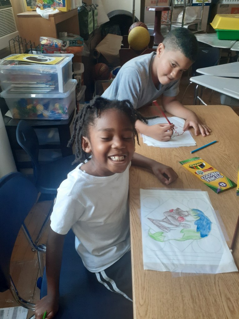
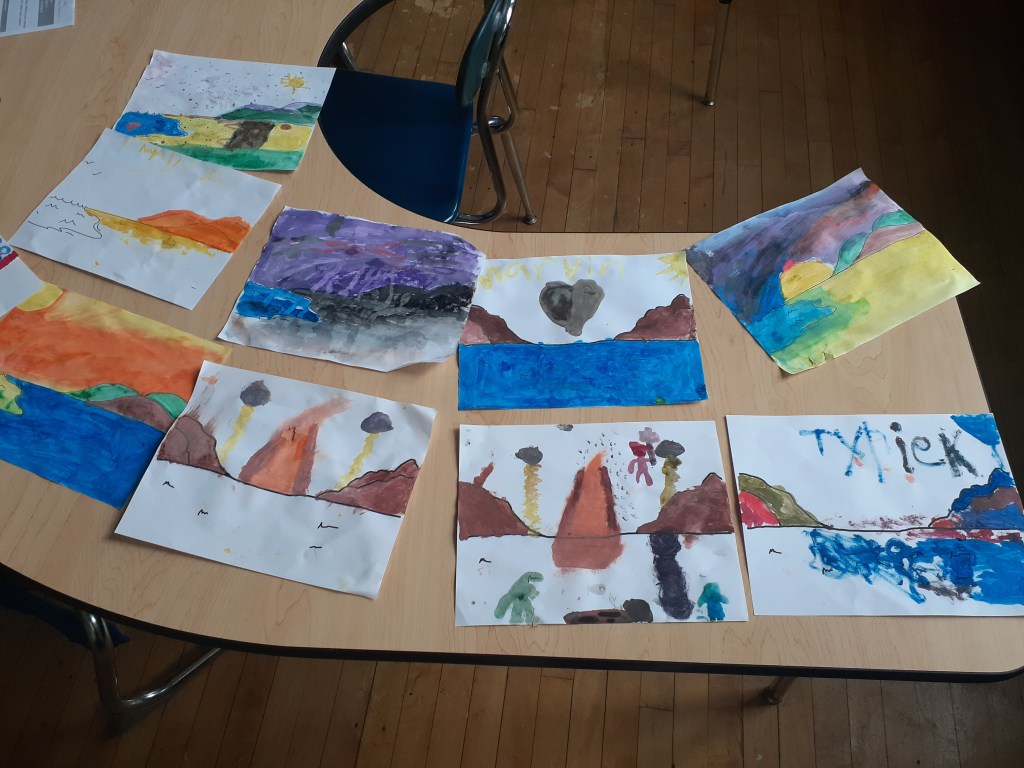
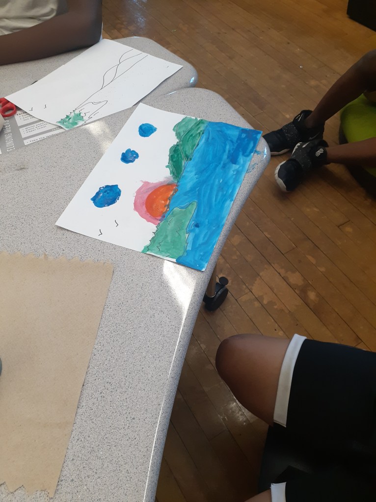
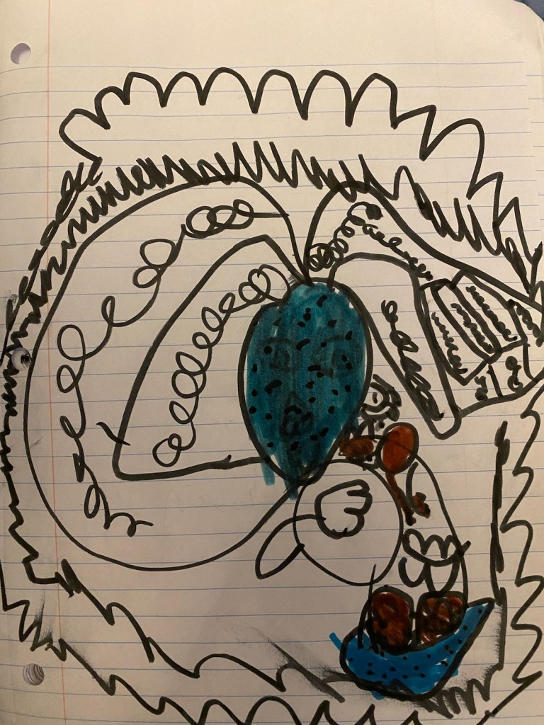
This weekend, we held an event at the Boston Kiddie Carnival. It was a fantastic cultural experience where we embraced Caribbean culture and heritage. This festival featured a parade where kids dressed in colorful costumes, danced to traditional Caribbean music, and celebrated with their families. There were also lots of fun stands scattered around the venue with exciting kids activities. One of these amazing stands was our interactive Kids.Think.Art. arts and crafts stand.

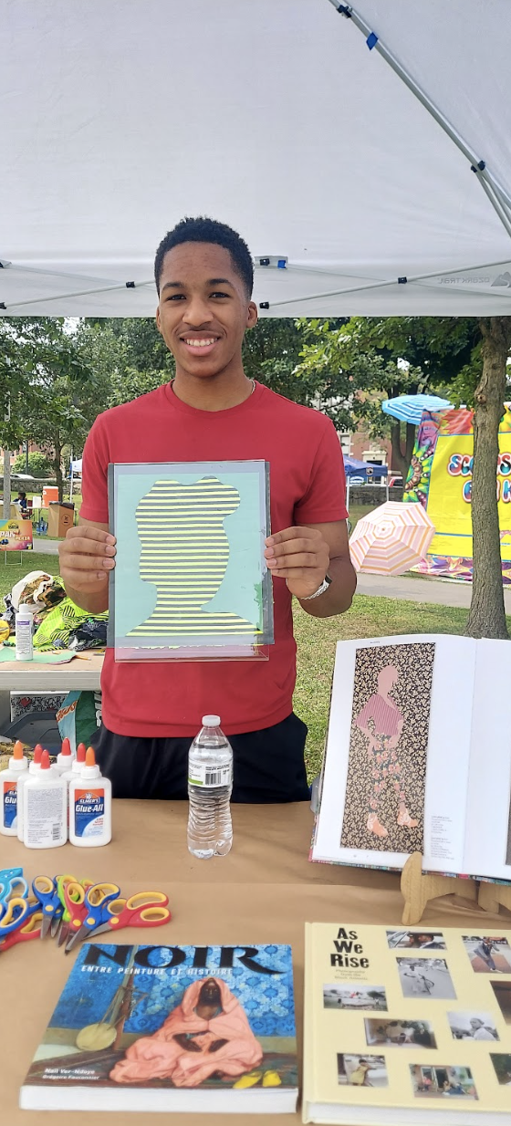
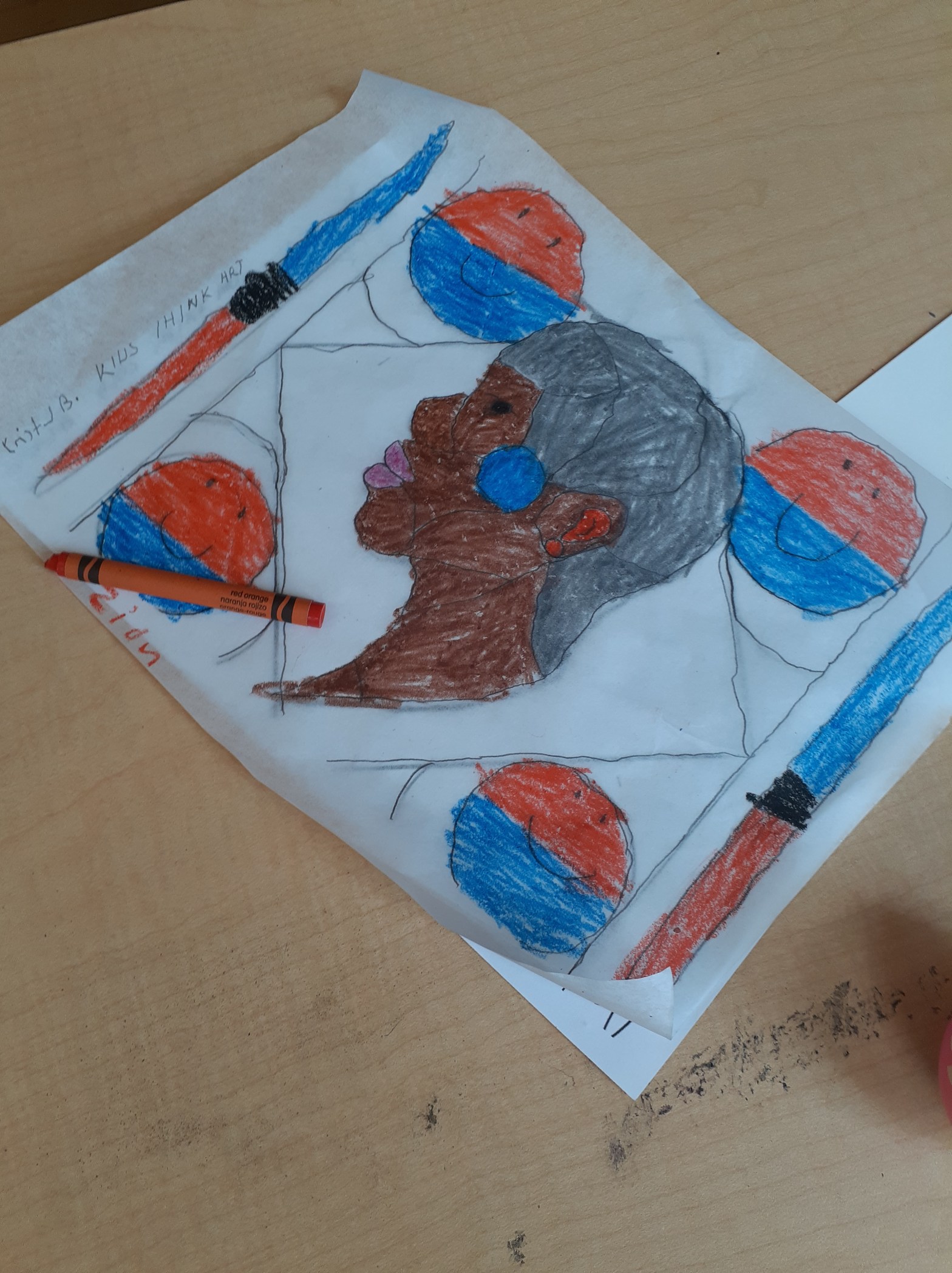
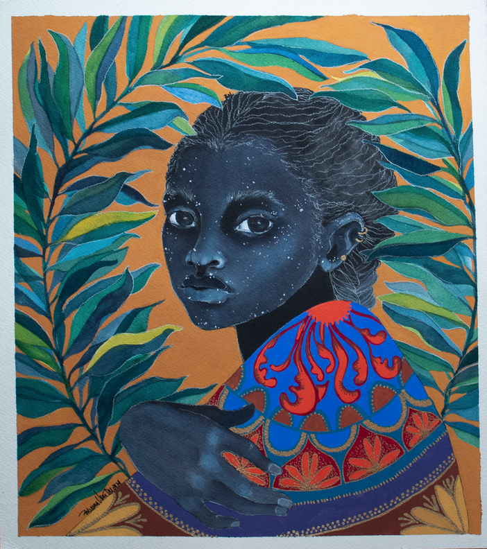
Textile Activity Inspired by Gio Swaby

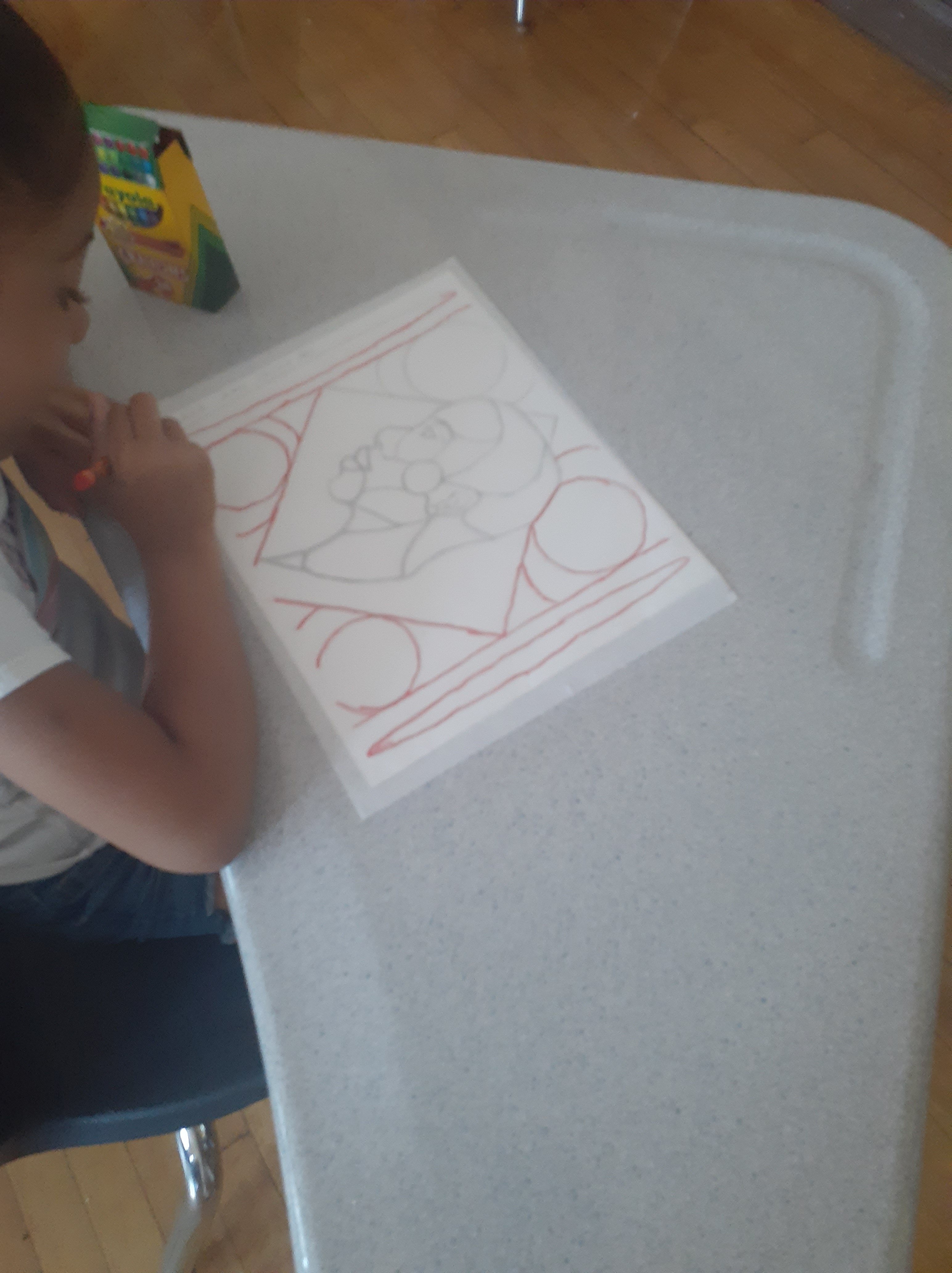
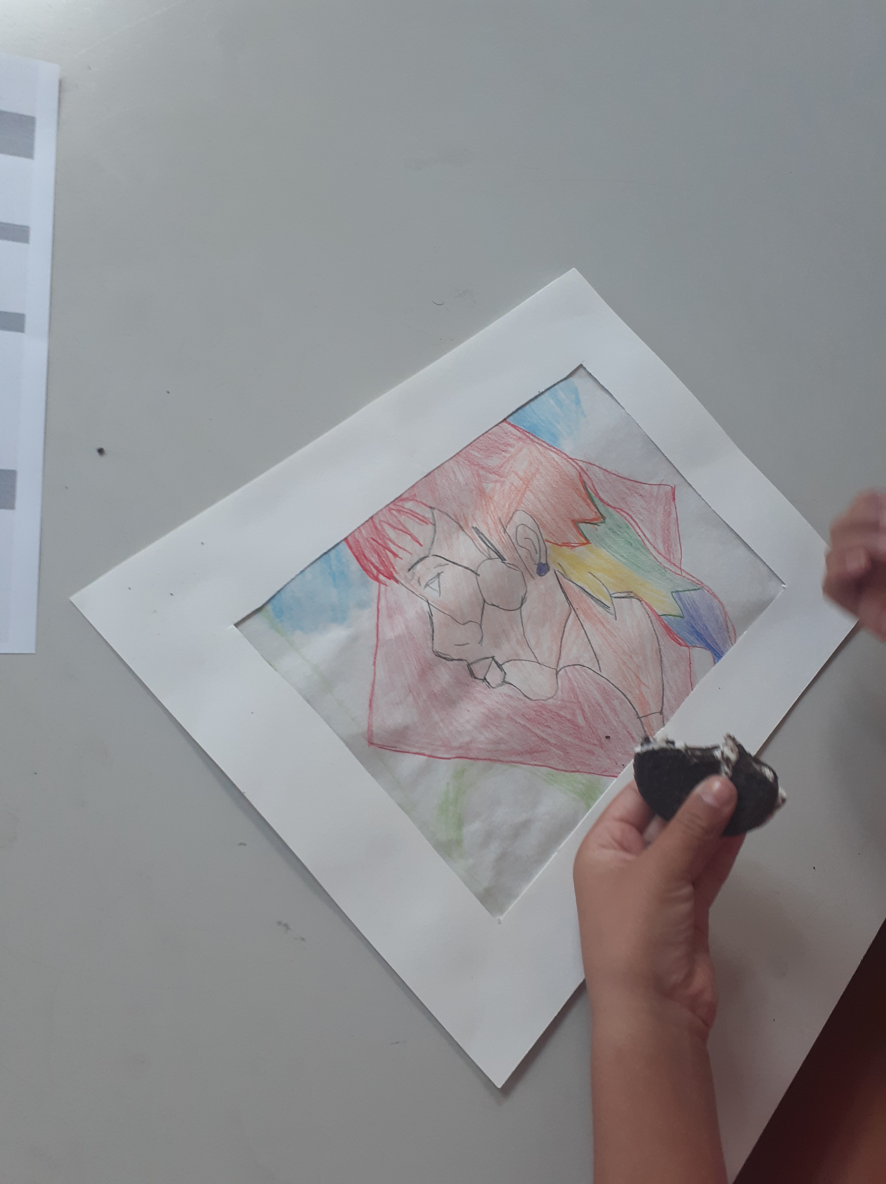
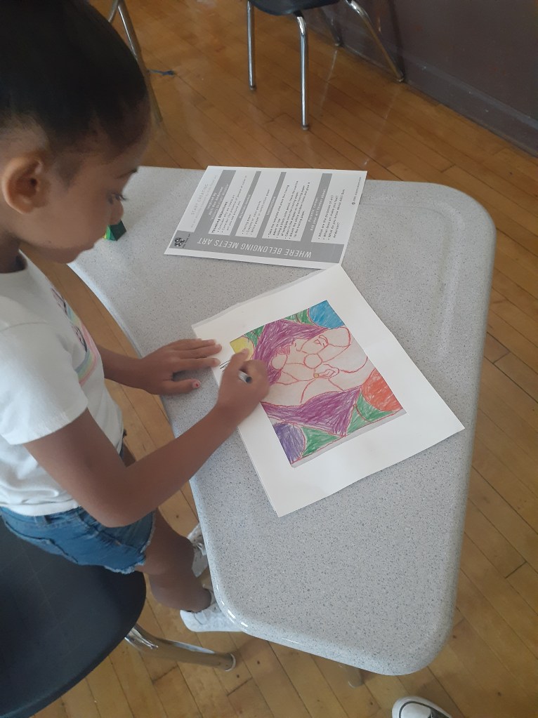
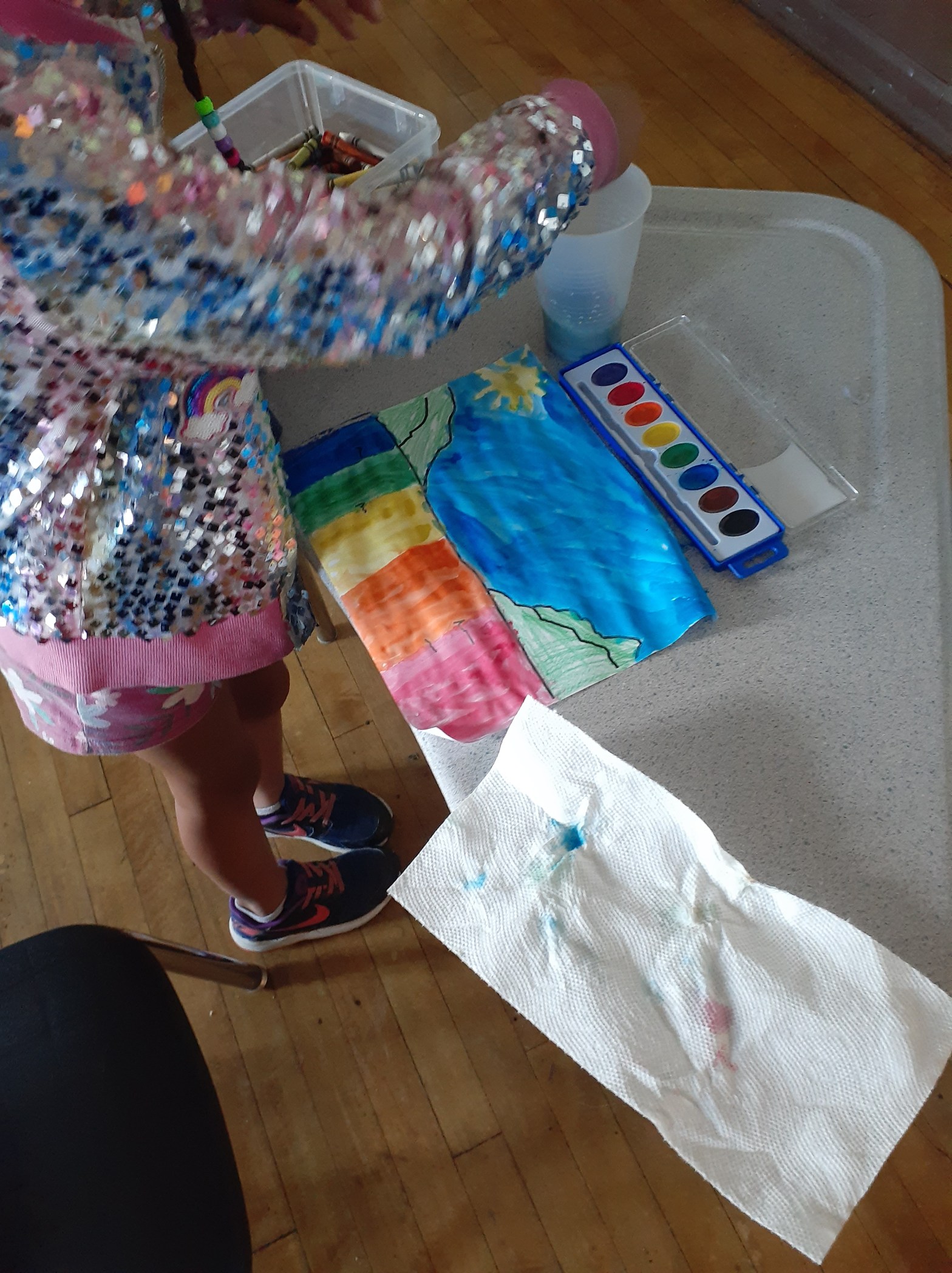
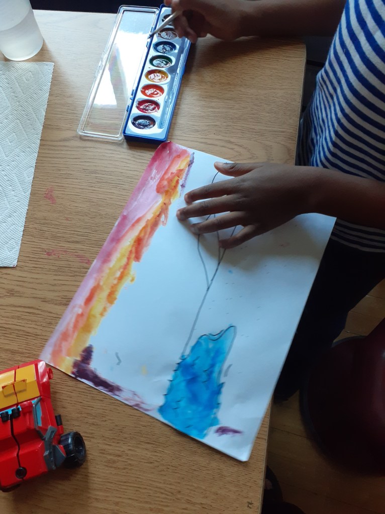
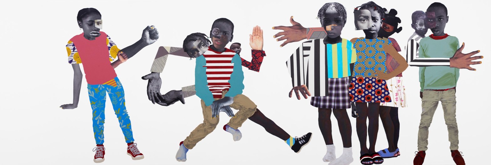
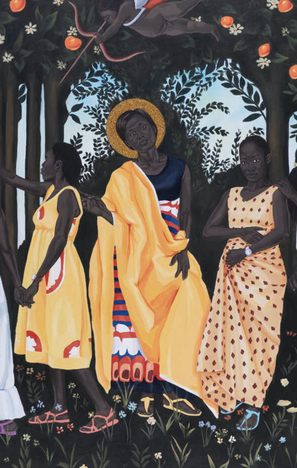
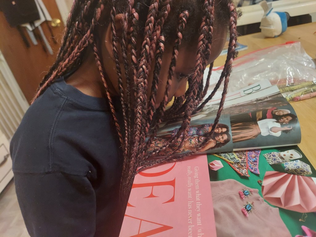
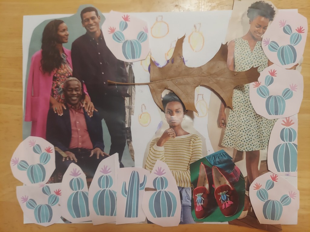
The inspiration for our activity was the Bahamian artist Gio Swaby who specializes in creating portraits using beautiful textiles. Each child made their own unique textile portrait by tapping into their inner creativity and using their critical thinking skills. At the end of the creation process, Ms. Yawa, founder of Kids.Think.Art, would remind each kid of the most important step, framing their portrait. She would remind them that their art was not official until they framed it. They were overcome with joy as they framed their artwork.

Connection with my Caribbean Roots

This was an amazing experience. Being with my Caribbean community reminded me of the deep connection that we all have with each other. Even though I was meeting all the wonderful families for the first time, it felt like we had a connection that I had not felt in a long time. Working with kids and assisting them with activities has always been a passion of mine. Spending time with them always brings a smile to my face as I see the excitement and joy in their eyes. There were many times where I saw my younger self in a lot of these little kids, which brought back many meaningful memories from my early childhood.

Written by Ryan Denny. A student at Milton High School.

Victory Skylight Window

Let us share more about the afterschool activity Kids.Think.Art organized this summer at the Martin Luther King Elementary School in Dorchester. This activity is centered around the work at Artist Akili Ron Anderson.

This week’s artwork and artist reflects the power of manifestation in the small world we live in. In elementary school, I had decided to become an art teacher. It was the only art job I could think of beside a professional artist. I was not completely confident in my decision as the adults around me insisted I choose another path that would guarantee success and income. Now that I’m teaching art to students, it is a full circle moment.


I also am very happy to teach the art thinkers about artists who are alive and thriving. They are excited about an artist they could potentially meet in person. The Victory Skylight Window serves a similar purpose, a potential for spiritual and cultural happiness.

The window is in a church, giving it religious value but it is also hidden within the artwork. I know from being in his class that Akili like to hide symbols, objects, and animals within his artwork. It gives the viewer the opportunity to determine the subject while still presenting an intended subject.

The students took a liking to that concept and were ready to create. The activity used transfer paper to create a window-like effect. Once the students found out that the paper was transparent, they couldn’t stop running to a window with their artwork.

I must wonder if Akili enjoys watching his students learn new things as much I did. And if he learns new things from them, I might try to make artwork using transfer paper, seeing what the art thinkers created.

This blogpost is by Kristel Boursiquot

Kristel Boursiquot is a Howard University student as well as an artist from Maryland. At Howard, she is currently studying art therapy, the intersection of art and psychology.  Her goal as an artist is to be an educator and research what drives people to be creative. She is happy to lead art thinkers through experiences where belonging meets art.

Landscape with Rainbow


This week’s artist was Robert Duncanson, an African American painter who focused on American landscapes as a way of healing or soothing his viewers. This concept reflects the ongoing potential the United States exudes as a country. Duncanson was a painter during the Civil War and took it upon himself to create scenic imagery that represented possible unity and harmony between the two sides. I also saw great potential in the students.

Robert S. Duncanson, Landscape with Rainbow, 1859, oil on canvas, Smithsonian American Art Museum, Gift of Leonard and Paula Granoff,


The young art thinkers automatically took a liking to the idea of creating a landscape. Many took artistic liberty to add rainbows, sunsets, bodies of water, and even a volcano to their landscapes. I believe in giving them the option to choose which design they wanted to use as well as keeping the designs as simple as possible gave the students creative reign over their paintings. Allowing them to have choice over what they create aids in their critical thinking and creativity.


Some students even took the opportunity to try different art techniques such as figure painting and splatter paint with the watercolor paint. It created quite a mess but also some memorable paintings. It was interesting to see you impactful Duncanson’s painting was to children who weren’t old enough to understand underlying meanings but to immediately comprehend the value of a serene landscape. Just by looking at the painting, they were happy. During the presentation there were students who were distracted but the activity grabbed their interest and eased any negativity.

This blogpost is by Kristel Boursiquot

Kristel Boursiquot is a Howard University student as well as an artist from Maryland. At Howard, she is currently studying art therapy, the intersection of art and psychology.  Her goal as an artist is to be an educator and research what drives people to be creative. She is happy to lead art thinkers through experiences where belonging meets art.

Brianna McCarthy and Willow Boughs and Things I Never Knew

I always build a session around an artwork that I feel will trigger interesting conversations with the art thinkers and/or teach them something new about an artist of color.

When I came across the work of Brianna McCarthy, I was actually looking for a response to an artwork by Jan de Visscher Black Boy with a Bow and Arrow.

Black Boy with Bow and Arrow, Jan de Visscher (after Cornelis Visscher) , undated

This piece stuck with me because while it is the portrait of a boy, his hands are those of an adult. While his face shows innocence, his look shows worries. While his surroundings are serene, his body is on alert. 

Resilience is a topic that comes up a lot within communities of color. From early on, I was taught that I need to work harder than other kids, that I need to be brighter, that I need to talk better, and that whatever happens to me, I need to bounce back faster. I never learned to dwell and to this day, I am not sure how to respond when my kids do so. 

For me, this piece by Jan de Visscher illustrates the fate of a child who had to grow up too fast. This is not what I want the art thinkers to remember about being a kid. I want them to see the beauty in them, and around them, and like my own children do today, I want them to dwell into their innocence and see their brilliance. 

Willow Boughs and Things I Never Knew, 2020, Brianna McCarthy

The piece “Willow Boughs and Things I Never Knew” came to mind very quickly. Brianna McCarthy is from Trinidad and Tobago and dedicates her work to exploring the topics of beauty and representation in West-Indian culture and beyond. The vibrancy of the colors in the painting, the interrogative gaze of the child, the sparkle on their face and the natural wreath elevating their person was a beautiful response to black and white revelations of the piece by de Visscher. 

Amara, 5 years old

The reactions of the art thinkers did not disappoint. They were looking at the scarf and how beautiful it was. One art thinker asked if the jellyfish on top of their shoulders was part of the scarf. When they created their own work inspired by the work of Brianna McCarthy, more comments came up about the beauty of the skin, that is not black but dark blue as noted by one child. Dark blue, like the color of the night.

Let Them Be Children by Deborah Roberts

The end of a season is always bittersweet. The art thinkers spend the last few weeks exploring and learning from various artworks together. They discovered artworks by emerging and contemporary artists from Cameroonian painter Marc Padeu to African- American artist Amy Sherald. During our critical thinking exercises, we also build up on each other’s cultural background and knowledge to revisit or construct narratives centered around people of color. 

Learn more:

The breath of work was large. There were collages, mix-media, photography, and painting. There was joy, laughter, and sadness. And always, this idea that nobody is wrong and no one is right. As kids thinkers grow, this will change. There will be times where they are faced with a single minded view of the world. There is no need to fasten time. Right now, it’s about them. It’s about their childhood and making sure that as they grow, they see their faces and their stories represented on canvas.

Let Them Be Children by Deboarah Roberts

This is why ending the season with the artwork Let them Be Children by Deborah Roberts has a deeper significance. It reinforced the mission on Kids.Think.Art to build art experiences where belonging meets art. 

The registration for the new session of our “I.Wonder.” programming is open now. Register today. Places are limited. 

Kids.Think. Art is supporting the Black Children’s Book Week from Feb 27th – March 5th! On Feb 27, 5 to 6 pm, I will be joining a panel discussion with three other Black mothers and founders who, each in their own ways, created spaces for their kids to flourish. You can register for the event Beyond Representation, Dismantling White Supremacy In Mainstream Children’s Media.

Boston and Allan Rohan Crite

Allan Rohan Crite, Ted A. Charron, Courtesy of Ted A. Charron and The Allan Rohan Crite Research Institute & Library

If you live in Boston and are immersed in the art scene, you certainly have heard of Allan Rohan Crite. Crite was a local African-American artist who depicted the life of African- American residents of Boston Roxbury and the South End neighborhoods.

A 5 or 9 years old kid may haven’t heard of this artist yet although he spends a lot of time drawing kids playing in the streets of Boston. Crite arpented the streets of Roxbury and the South End and drew everyday people doing everyday things. On Sundays, he was known to sit on the stairs of his house at 410 Columbus Ave and simply draw the faces of people he would meet. 

One of his most famous drawings, Jumping Rope, pictures kids playing in the street while adults dressed on the T come and go. This painting is on view at the MFA, Boston and is part of the neighborhood painting Crite did in the 1930’s and 40’s.

For Kids.Think. Art’s program “ I.Wonder.”, I selected a less famous drawing of Crite but as significant of his artistry in drawing street scenes and . I guided the art thinkers through a critical thinking exercise with the piece Sunlight and Shadows.

Sunlight and Shadow, 1941, Allan Rohan Crite

What immediately got the art thinkers’ attention was the stroller and the tricycle on the forefront of the drawing. First, the art thinkers thought that the boy needed help to get out of the stroller. With further interrogation, they realized that he needed assistance to bike and that two girls were helping me to maneuver the tricycle. 

Despite the vibrant colors of the clothes of the characters, the art thinkers picked on the sad mood of the scene. The woman wearing a white dress on the left of the painting put her hand on her hips in what could be a sign of exasperation. “ She is upset that the kids are not listening,” said one art thinker. On the far right side of the painting, the woman sitting on the bench seems very tired. “Her legs are crossed and her shoulders are down,” observed another art thinker. “ The other women around her are talking to her,” added another art thinker. 

It is only toward the end of the session that a couple of art thinkers pay attention to the older woman in the center of the artwork although she was there all along. “ She doesn’t look like she is going anywhere, ” ended one of art thinker.

The element of surprise with Amy Sherald

Rockets, Planes, and the Spaces in Between, 2018 by Amy Sherald 

“ This is not what I expected, ” said one of our art thinkers when we worked together on the artwork “Planes, Rocket, and the Spaces in between” by Amy Sherald. 

 We had just done an exercise where one of the art thinkers described the artwork to their peers who needed to draw it based on their description only.  We had opened the session for feedback where kids who drew were sharing with the describer what would have been helpful to know about the artwork. 

During the exercise, kids were allowed to ask questions to get more information about what to draw. They asked a lot of questions about the clothes of the two figures in the artwork. The rainbow dress of the main character was a big hit. “What color is her rainbow dress? How many colors are there? What does she have in her hair? A bow? What color is the bow? What is the other girl wearing? What is the color of her skin?” These are some of the many questions the kids asked the describer. Eventually I guided the conversation to the background. We could have spent the entire session talking about these mysterious characters. Who are they? What is their name? Where are they going? What are they doing? Are they friends or are they related ? So many questions and only a few answers!

The elephant in the room is that there is a big rocket in the background who seems to have difficulty taking off. “ A tiny rocket with a lot of smoke behind it,” said the describer, “and mountains in the back, oh no, there is just more smoke” they added, “and yellow grass, a lot of yellow grass! ” they concluded. 

The art thinkers are showing their own artwork inspired by “Rockets, Planes, and the Spaces in Between”

Toward the end of the session, we had a big reveal moment where all the participants showed their art to one another and looked at what others did. There was only one narrative during the session but every art thinker created their own version of “Planes, Rocket, and the Spaces in between”. They have unique renditions of an art piece that invited them to pay attention and listen carefully to instructions. Without knowing, they learned what was most important to know about the art of Amy Sherald. 

In her work, Amy Sherald has been drawing ordinary Black people doing everyday things like holding hands or playing, or just resting. Black bodies have often been attached to signs of resistance. By depicting Black people doing ordinary things ( sometimes in an extraordinary landscape like in today’s artwork), Sherald aims to focus on the characters’ humanity and opens new realms in which Black people can see and imagine themselves. 

This is exactly what I wanted the art thinkers to remember today: imagine what they want to be without thinking about what people want them to be.

Watch this video to learn more about Amy Sherald’s creative process 

Introducing our logo

Selecting our logo for Kids.Think.Art has been a long time coming. 

I started Kids.Think.Art in October 2020 as a bandaid for racial divides I saw in the art world. At the beginning of this adventure, I gathered my kids’ friends to see, think, and wonder about art by and with people of color. I had just graduated from the 2019 Gallery Instructor program at the Museum of Fine Arts, Boston, an innovative program that trained educators and art lovers to give art tours to K-12 students. 

The pandemic forced museums and other places of culture to close doors in March 2020, a few weeks before I was supposed to start giving tours. The pause was supposed to last only a few weeks, then only a few months. More than 2 years into the pandemic, there is a deep understanding that nothing will be like it was before. During that time, a project that started as a band aid solution transformed into the organization I called Kids.Think. Art. 

I wanted the name to convey that our programs were about more than art. In our programs, I don’t teach you how to draw. There are countless people who can teach drawing way better than I do. In our programs, I don’t teach adults. There are countless classes for adults to learn about art. What I do though is to center the conversation on the kids’ approach to art and how their various cultural backgrounds change how they see and appreciate art. During a session on the portrait John, 1st Baron Byron by Kehindey Whiley, one of the participants mentioned that the person at the center of the artwork looked like her uncle. This is in part what I live for with Kids. Think. Art : breaking down barriers between kids and the art pieces on the wall. While the name Kids. Think. Art conveys what we do, the logo conveys what we want to be. A place where kids feel like they belong and that art is as much for them than for anybody else. After several iterations, our logo and tagline was complete. Kids.Think. Art, where belonging meets art.

Romare Bearden in details

 A lot needs to be said about Romare Bearden. He was an African-American artist. His family moved from the South to New York City when he was young. He loved music and jazz. He loved cats too. Indeed, a lot needs to be said about Romare Bearden, but it is in the details that the art thinkers got to know him better. We explored Romare Bearden’s piece “the Conversation”, 1979 in one of our session.

The Conversation, 1979 by Romare Bearden

Nature

Nature is the first element that captures the art thinkers’ attention. One thinker noticed a river running in between the fields, another one contradicted their statement, pointing out that the fields were in fact a pond. There are no right or wrong answers, there is simply more attention to details that help build a broader story and highlight the message the artist wants to pass. Nature is overflowing this artwork with mountains in the background, a gigantic sky and a bright sun, but nothing sounded more fascinating to one art thinker than the number of leaves and branches in the tiny bush next to the hen. Attention to details. 

The Industry

One art thinker quickly identified a factory at the center of the piece and zoomed on the open window on top. Several kids commented about the train and its destination but none about where it came from. I am always surprised at what kids actually pay attention to. It is never what I anticipate.

The Conversation

The comments about the two main figures of the artwork were captivating. “They are sisters,” said one art thinker. “The oldest one is here, and the little sister is here,” said another one. “ They look like they are sharing a secret and talking slowly,” said another kid. “I like their earrings.” mentioned another art thinker while touching their ears. I have seen this artwork many times, but never have I imagined so vividly what these two figures were sharing with one another. 

Guiding kids in critical thinking exercises through art is about all these details that keep unraveling themselves every time someone new look at them. The thinking is in the details. The details make the story.

Did you see “le Printemps”?

Le Printemps, Marc Padeu, 2019

Facilitating critical thinking sessions using art is always fascinating because kids see details of the artwork that no one has ever thought about before. The first session of the program “I.wonder.” didn’t derogate from this statement. During this session, the art thinkers look at the painting Le Printemps by Cameroonian artist Marc Padeu.

The obvious

Right section of le Printemps

The vibrant colors are very appealing. The orange in the wrapping of the man on the left competes with the color of the fruits in the trees. We didn’t get to a consensus about the nature of the fruit. They may have been oranges or apples, or pomegranate. “They look very yummy” is the conclusion the art thinkers came down to. 

The surprise 

What was more surprising is the additional layers of thinking. The more we explore the artwork, the more kids discover the meaning of this artwork. The little angel at the top of the artwork is more threatening than friendly. Everybody is wearing flip flops except one girl. What is so unique about her? There are only two men in the picture and they are both on the side of the artwork. Are they protecting the girls? Several art thinkers keep coming back to the drama developing on the right side of the painting. One art thinker mentioned that the boy on the left may be an angel because he has wings. Another mentioned that he may be a part of the tree because he has no legs. What is going on with the girl next to him? Is he trying to take her away or hold on to her. These are many questions that pushed the art thinkers to explore the artwork closely and appreciate each detail the artist wanted the viewer to pay attention to.

At the center

Center section of le Printemps

Once the attention turned to the woman in the middle wearing “a brownish or golden hat”, the dynamic of the group changed. They were bouncing statements out of each other as if they were racing toward an answer.  “She might be the mother,” one kid said. “ Because she seems older,” they continued. “ They may be a family, these are the sisters and the boys are the brothers,” another said. “ Maybe they are lost and they are trying to find their way out of the forest”. There are many layers that an older public would have unrevealed and would have jumped at comparison with classical and biblical art. Our art thinkers are between 5 and 9 years old and worked together to gain an unique understanding of an artwork by an emerging artist. 

An activity based on the Printemps

What you need

  • Paper 
  • Magazine, ads
  • Crayons
  • Glue

Steps for a 30 min mix-media artwork

  1. Help your art thinker collect magazines, print ads or any media that includes people of color together. Bonus point if they look like a family. This activity will help you and your kids to think about how people of color are portrayed in the media. Look, select, and cut. Let your kid place the printed images as they wish on a white piece of paper and glue them.
  2. During the session, your kid shared what was their favorite fruit. They can draw it on the white paper
  3. Add the greenery. In the picture my kid made, she decided to take leaves and glue them to her artwork. We also found an old bag of party favors with cactus all over. We cut the cactus and added them to her masterpiece. And voila, here is my kids interpretation of the Printemps by Marc Padeu. Try it out, and feel free to share your kids’ picture!
Makeda’s masterpiece

:)